Custom t-shirts have become an essential canvas for self-expression, creativity, and brand promotion. They serve various purposes, from casual wear to marketing tools for businesses. However, the key to a successful custom t-shirt design lies not just in the concept but in executing it with the right fonts and colors that resonate with your intended audience. In this comprehensive guide, we'll explore the art of choosing the best fonts and colors for custom t-shirts. By understanding how these elements work together, you can create designs that stand out, communicate effectively, and leave a lasting impression.
Choosing the Perfect Font for Your Custom T-Shirt

When it comes to t-shirt design, fonts play a pivotal role. They are more than just letters on fabric; they convey emotions, establish identity, and set the tone of your message. Selecting the perfect font requires careful consideration of readability, personality, and compatibility with your overall design theme.
The first step is determining the primary goal of your t-shirt. Is it meant to promote an event, showcase a brand, or simply communicate a fun message? Understanding your design’s purpose will help in making informed choices regarding font style.
Readability: Essential for Impact
Readability should be at the forefront when selecting a font. A beautiful typeface is ineffective if viewers struggle to decipher what it says. Thus, always consider how your chosen font performs in various sizes and across different backgrounds.
When designing for a custom t-shirt, keep in mind potential viewing distances. For instance, if someone is standing several feet away, the text must be bold enough to grab attention while remaining legible. Scripts and intricate designs might look stunning up close but can cause confusion from afar.
Additionally, the placement of text on the shirt matters immensely. Make sure the chosen font complements the space where it will sit. A large central design may call for a sturdy, sans-serif font, while smaller text details could feature a more decorative style if contrast is appropriately maintained.
Personality and Tone: Aligning with Your Message
Fonts possess distinctive personalities, making them powerful tools for conveying messages. The choice between a whimsical script or a clean sans-serif font can significantly impact how your audience perceives your t-shirt.
For instance, a quirky font might work wonders for a playful event like a music festival, while a sleek, modern font may better suit a corporate branding initiative. Exploring the personality trait of each font style will ensure that there’s harmony between your design elements and the message you want to send.
Moreover, contextual elements such as cultural implications and trends should also factor into your font selection. For example, certain fonts may invoke nostalgia or modernity, depending on generational preferences and cultural influences. Stay attuned to current design trends while honoring your unique voice.
Compatibility: Enhancing Overall Design Theme
The relationship between your font choice and other design elements cannot be overstated. Fonts need to relate well with colors, graphics, and themes present in your design. This synergy helps create a cohesive look that resonates with your audience.
Consider experimenting with font pairings to enhance visual interest. Combining a strong display font with a simple sans-serif can add depth to your design while ensuring readability. However, exercising restraint is crucial—too many different styles can lead to a chaotic appearance that detracts from the message.
Ultimately, take time to explore various combinations and iterate on your designs. Each adjustment can lead to a fresh perspective that elevates the final product and ensures all components work in harmony.
Font Styles for Every Occasion: From Casual to Formal

Different occasions call for particular font styles, which can dramatically influence the perception of your t-shirt designs. The diversity of font categories allows designers to cater to specific themes, events, or brand identities.
Understanding the characteristics of various font styles enables you to make purposeful selections that align with your vision.
Casual Designs: Embracing Playfulness
Casual events often lend themselves to playful, approachable fonts. Handwritten scripts or rounded sans-serifs can evoke feelings of joy and warmth, making them ideal for relaxed settings like family reunions, picnics, or informal gatherings.
For instance, a hand-drawn font can resonate well with younger demographics, contributing to an inviting, friendly atmosphere. Think about using bright colors and fun graphics alongside these fonts to amplify the cheery vibe.
Formality in Designs: Achieving Elegance
On the contrary, formal events demand fonts that exude sophistication and professionalism. Serif fonts, known for their elegant strokes, are perfect for formal occasions such as weddings, corporate events, or charity galas.
A classic font like Garamond paired with muted colors and minimalistic graphics can elevate your design. The emphasis here should be on clarity and refinement, ensuring that the font communicates authority without feeling overpowering.
Versatility: Blending the Lines
While casual and formal fonts can easily be categorized, many designs benefit from versatility. Hybrid events—such as parties that transition into more serious discussions—allow for innovative font pairings that can strike a balance between playfulness and elegance.
By incorporating both types of fonts, designers can create unique narratives that adapt to varying atmospheres. For example, a display font might highlight the event name, while a serif font provides essential information in a refined manner.
Top Fonts for Readability and Impact

In the world of custom t-shirt design, some fonts stand out due to their remarkable readability and aesthetic appeal. These fonts effectively communicate messages while creating visual interest, making them top picks for t-shirt creatives.
Choosing impactful fonts will positively influence the effectiveness of your design, so knowing which fonts excel in these areas is crucial.
Sans-Serif Fonts: Clean and Modern
Sans-serif fonts, characterized by their lack of decorative strokes, are renowned for their clean lines and versatility. With options like Helvetica, Arial, and Roboto, these fonts easily adapt to various design contexts, making them favorites for multiple applications.
Their minimalist appearance contributes to high readability, especially in digital formats. When printed on fabric, sans-serif fonts maintain clarity and present your message distinctly, regardless of size or background color.
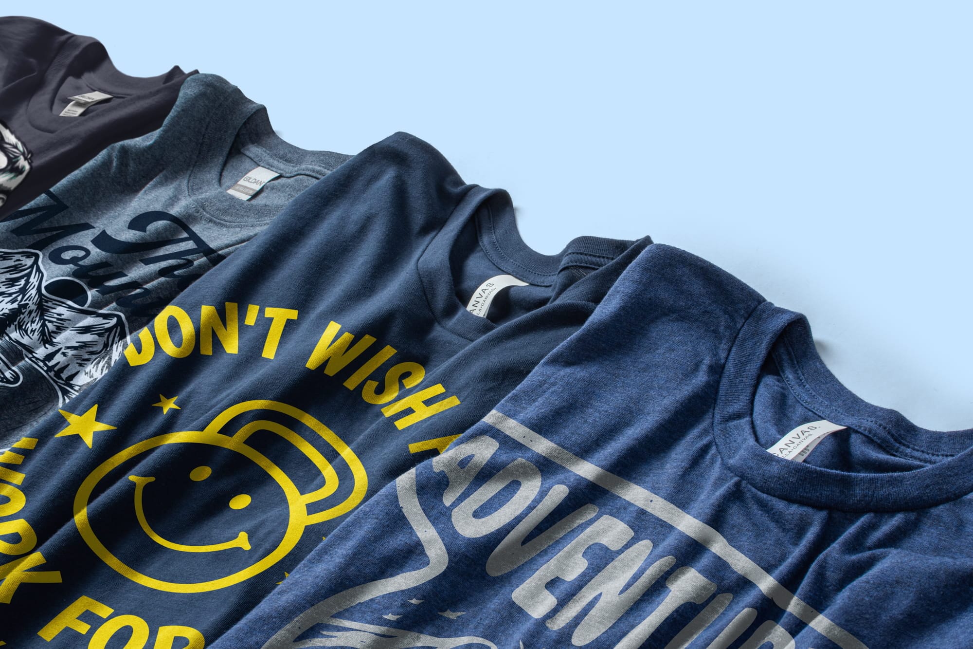
Bold Display Fonts: Commanding Attention
Display fonts are designed to attract attention, making them ideal for headlines or slogans. Options like Impact or Bungee offer striking aesthetics that can effectively grab viewers’ attention in bustling environments.
However, it's vital to use display fonts judiciously. Utilizing them for significant statements or event titles creates a focal point without overwhelming the entire design. Coupling display fonts with simpler body text can strike a harmonious balance.
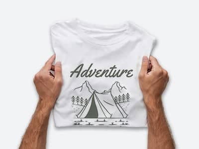
Script Fonts: Elegant Flourishes
Script fonts bring a touch of elegance and individuality to t-shirt designs. While they can be challenging in terms of readability, carefully selected script fonts can enhance designs when used appropriately.
Opt for script fonts like Pacifico or Great Vibes for less cluttered designs or prominent quotes. This way, their flowing nature adds charm without sacrificing comprehension. Remember to consider the text length, as shorter phrases work best with ornate scripts to maintain legibility.
Color Combinations That Pop: A Guide to T-Shirt Color Palettes
Color plays a crucial role in t-shirt design, eliciting emotional responses and capturing attention. Choosing the right color palette can significantly affect the appeal and effectiveness of your custom t-shirt.
Understanding color theory and how to combine various hues is essential for creating visually striking designs that communicate your message effectively.
Complementary Colors: Creating Visual Vibrancy
Complementary colors are pairs of colors opposite each other on the color wheel, providing high contrast when combined. Utilizing complementary color schemes—such as blue and orange or red and green—can generate vibrant designs that catch the eye instantly.
When applying complementary colors, aim to balance the proportions to avoid overwhelming the viewer. One color can dominate while the other provides accents, resulting in a striking yet harmonious design.
Monochromatic Schemes: Subtle Sophistication
Monochromatic color schemes utilize variations of a single hue, providing a subtle yet sophisticated appearance. Lighter shades, darker tones, and mid-tones of one color can create depth and interest while maintaining a cohesive look.
This approach is particularly effective for brands seeking to establish a minimalist style. For example, different shades of blue can evoke tranquility and professionalism, making it suitable for corporate settings.
Analogous Colors: Harmonious Blends
Analogous colors are those situated next to each other on the color wheel, resulting in harmonious blends. These color combinations generate a sense of unity and cohesion while offering variety in your t-shirt design.
Using analogous colors like blue, teal, and green can create tranquil designs that resonate with natural themes. Experimenting with similar yet varied hues allows for creative exploration while maintaining visual harmony.
The Psychology of Color: How Colors Affect Your Message

Color psychology plays a pivotal role in shaping perceptions and evoking emotions. Understanding how colors influence feelings will enable you to choose palettes that align with your desired message.
Different colors communicate distinct meanings, making awareness of their psychological impact important in custom t-shirt design.
Red: Passion and Energy
Red is often associated with passion, energy, and excitement. It captures attention immediately and encourages quick decision-making. As such, red is an excellent choice for designs aimed at motivating action, such as promoting events or showcasing dynamic brands.
However, while red can invigorate, it can also overwhelm when overused. To maintain balance, consider utilizing it as an accent against softer colors, allowing the design to breathe.
Blue: Trust and Calmness
Blue embodies trustworthiness, calmness, and stability. Its soothing qualities make it popular among brands aiming to establish credibility, such as financial institutions or healthcare services.
Combining blue with neutral colors can create a professional and reassuring appearance. When designing t-shirts for corporate events or professional endeavors, incorporating varying shades of blue can foster a sense of reliability.
Green: Growth and Nature
Green represents growth, health, and environmental consciousness, making it an appropriate choice for initiatives involving sustainability or wellness. Earthy greens can evoke a sense of connection to nature, aligning perfectly with eco-friendly brands.
Utilizing green tones in combination with brown or beige can reinforce organic themes. Such palettes can create harmony in designs while appealing to audiences who value sustainability.
Creating a Cohesive Design: Font and Color Harmony
Design harmony occurs when all elements work together seamlessly to convey a unified message. Striking a balance between font choice and color application is vital to achieving this harmony in your custom t-shirt designs.
Taking time to evaluate how fonts and colors interact will greatly enhance the overall quality of your design.
Contrast: Enhancing Visibility and Interest
Creating contrast between font colors and background colors is crucial for visibility. Light text on a dark background or vice versa ensures that your message stands out and attracts attention.
Experimenting with various color combinations is essential to find the right level of contrast. Avoiding overly busy backgrounds allows the text to remain the focal point, enhancing both readability and aesthetic appeal.
Balance: Avoiding Overwhelm
Balancing various design elements prevents overwhelm and chaos in your t-shirt designs. Too many fonts or colors can disrupt the flow and make it hard for viewers to focus on any single aspect.
Aim to limit your designs to one or two primary fonts and a coherent color palette. This restraint leads to a polished appearance and enhances the visual impact of your design, making it easier for viewers to absorb the intended message.
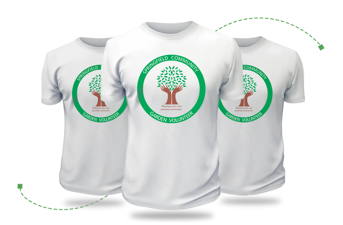
Consistency: Reinforcing Brand Identity
If you're designing custom t-shirts for a business or event, ensure consistency in font and color choices to strengthen brand identity. Using established brand colors and fonts reinforces recognition and familiarity among your target audience.
Maintaining consistent design elements across various promotional materials builds trust and loyalty, making customers feel connected to your brand and facilitating engagement.
Choosing Colors for Different Target Audiences
Understanding your target audience is instrumental in selecting appropriate colors for your custom t-shirt designs. Various demographics respond differently to color, influencing purchasing decisions and emotional connections.
Considering the preferences and expectations of your audience will enhance the effectiveness of your designs.
Youthful Audiences: Vibrant and Energetic
Younger audiences often gravitate toward bold and vibrant colors that express energy and enthusiasm. Bright shades of yellow, purple, pink, and teal can resonate well, embodying a spirited, youthful essence.
When designing for events targeting youth—like music festivals or college gatherings—incorporating lively color combinations will attract attention and encourage participation.
Mature Audiences: Classic and Subdued
In contrast, older audiences may prefer more subdued and classic color schemes. Earthy tones, pastels, and muted hues can evoke feelings of warmth and reliability, making them more appealing.
For instances like charity events or formal gatherings, leaning towards soft, sophisticated palettes paired with elegant fonts can create an inviting atmosphere for mature audiences.
Niche Markets: Tailoring to Specific Interests
When designing for niche markets, tailor your color choices to reflect the interests and values of those communities. For instance, fitness apparel may benefit from energetic colors like neon green or fuchsia, while eco-conscious designs might lean towards greens and browns to emphasize sustainability.
Conducting research on target demographics ensures that your designs resonate with specific audiences, leading to greater engagement and sales.
Trends in T-Shirt Design: Font and Color Inspirations

Staying up-to-date with design trends is critical for creating contemporary and relevant custom t-shirts. While timeless principles remain essential, embracing new aesthetics can provide fresh perspectives for your designs.
Exploring current trends will inspire creativity and innovation within your design process.
Retro and Vintage Aesthetics
Retro fonts and colors have made a strong comeback in recent years, with nostalgic looks attracting both young and older generations. Fonts resembling classic signage or vintage labels evoke feelings of comfort and familiarity.
Pairing retro fonts with muted, faded colors can enhance the nostalgic quality, bringing a sense of warmth and charm to your t-shirt designs.
Minimalism: Less is More
Minimalist designs continue to thrive, emphasizing clean lines, limited color palettes, and uncluttered layouts. Sleek sans-serif fonts paired with monochromatic color schemes exemplify this trend, focusing on simplicity and functionality.
Emphasizing quality over quantity encourages thoughtful design choices, allowing your message to shine without distraction. Minimalist t-shirts work exceptionally well for professional settings or chic casual wear.
Artistic Illustrations: Bringing Graphics to Life
T-shirt designs featuring artistic illustrations have gained popularity as consumers seek unique, expressive pieces. Incorporating custom typography alongside illustrations allows for greater storytelling opportunities while establishing a distinctive visual identity.
Experimenting with hand-drawn fonts or playful letterforms can contribute to a more personal and engaging design. Exploring creative elements in conjunction with graphic illustrations will create a memorable and striking t-shirt.
Tips for Designing Your Own Custom T-Shirt

Designing custom t-shirts can be an enjoyable and fulfilling creative process, but it does require strategy and planning. Here are some practical tips to help you navigate this journey effectively.
Begin with Inspiration
Before diving into your design, gather inspiration from various sources—social media platforms, design websites, or even local clothing stores. Identifying trends you admire can help inform your choices while paving the way for creative exploration.
Create an inspiration board to compile your ideas, visuals, and color palettes. This exercise allows for a clearer vision as you begin crafting your own unique designs.
Utilize Design Tools
Online design tools such as Canva, Adobe Illustrator, or Photoshop can significantly simplify your workflow. These platforms allow you to experiment with different fonts and colors while enabling quick iterations.
Take advantage of templates and pre-made assets to familiarize yourself with design principles. With practice and exploration, these tools will empower you to create stunning custom t-shirts confidently.
Seek Feedback and Iterate
Once you've created initial designs, share them with friends, family, or potential customers for feedback. Constructive criticism can provide valuable insights into how others perceive your designs and help identify areas for improvement.
Iterate upon your designs based on feedback, refining your work until it reflects your vision while resonating with your audience.
Where to Find High-Quality Fonts and Color Resources
Finding the right resources is essential to ensuring the success of your custom t-shirt designs. Accessing high-quality fonts and color palettes can elevate your creations and facilitate the design process.
Font Libraries and Marketplaces
There are numerous online font libraries and marketplaces where you can explore and purchase unique typefaces. Websites like Google Fonts, Adobe Fonts, and Creative Market offer extensive collections of fonts catering to various styles and preferences.
Always check licensing agreements before using fonts for commercial purposes to avoid legal issues down the line. Investing in quality fonts will enhance the professionalism of your designs and set your t-shirts apart.
Color Palette Generators
Finding the ideal color combinations can be challenging, but several online tools make this process easier. Resources like Coolors, Adobe Color, and Color Hunt allow you to create and explore diverse color palettes.
These tools provide inspiration while helping you understand how different colors interact. Save your favorite palettes for future reference and experimentation in your t-shirt designs.
Design Communities and Inspiration Platforms
Engaging with design communities, such as Dribbble or Behance, can expose you to emerging trends and innovative ideas. Connecting with fellow designers will provide insight into new techniques and approaches, fostering creativity and growth.
Additionally, platforms like Pinterest allow you to curate boards filled with inspiring graphics, typography, and color combinations. Leverage these communities for motivation and direction while pursuing your design journey.
Conclusion
Selecting the best fonts and colors for custom t-shirt designs is a nuanced process that can significantly impact the effectiveness of your creations. Understanding the interplay between typography, color psychology, and audience preferences sets the foundation for producing visually appealing and communicative designs. Whether crafting a playful graphic tee or developing a polished branded piece, the right combination of fonts and colors can elevate your message and leave a lasting impression.
With the insights provided in this guide, embrace the creative process fearlessly. Experiment, iterate, and listen to feedback as you develop custom t-shirts that authentically represent your vision. Ultimately, the fusion of thoughtful design choices will ensure that your t-shirts stand out in a crowded marketplace, successfully capturing hearts and minds alike.